Really crafty Publicity Hounds will be able to weave into the letters other information about their companies without making it sound like a free commercial.
Meg Weaver, who reports on the magazine industry through her excellent Wooden Horse Magazine News ezine, says:
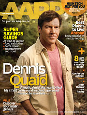
AARP, the Magazine has a new look, starting with the September/October issue that shows actor Dennis Quaid on the cover. It has more white space and shorter articles, in addition to a redesigned website. The bi-monthly magazine is mailed to its more than 24 million members, with slightly different verisons for each age group (50-59, 60-69, and over 70).
Forbes will launch its redesigned magazine and website on Wednesday, Sept. 22. They even created a Facebook Fan Page to promote the redesign. If you comment on the new look on the Fan Page wall, you have a chance to win an iPad.
Publishing companies often spend big bucks on redesigns. That’s why it’s smart for Publicity Hounds to comment on a magazine’s new look, or even things such as new features, departments and columnists.
During the teleseminar I hosted on “How to Use Newspaper and Magazine Editorial Pages,” I explained the two types of letters that editors LOVE to publish: those that take a strong stand on a controversial issue, or letters that comment on recently published articles.
A redesign fits into that second category. Comment on the redesign and explain why you love it, or hate it, and chances are good the editors will print your letter.
What publications would you like to get into, and what have they done lately that you can comment on via a letter to the editor? How else do you use letters to the editor or a newspaper’s or magazine’s editorial pages for publicity?
Hi Joan,
I appreciate the heads up. This is just the kind of information we can always expect from your newsletter. Thanks for always helping us to be ahead of the game.
All the best, 🙂
I like the AARP the magazine for starters. It’s always full of some article worth reading. The newsletter is equally informative and I know someone at the top there and how hard he works to make it good.
These changes are subtle for the magazine and maybe that’s the best way to go about it. It’s like being a woman who goes from blond to red and people say “Oh, I liked it the other way.”
I’ll read AARP the magazine regardless of what the cover looks like but I’m the kind of reader that likes what inside the cover be it book, magazine, newsletter or person.
Thanks, Joan.
P.S. I like the new look of your blog, too!
MJ