
About This Guest Blogger:
* * *
By Marcia Yudkin
In the last few years, you’ve undoubtedly run across infographics—colorful digital posters containing some kind of educational theme illustrated with cute images and numbers. You often can’t help but want to share them, because they feature points made in a simplified yet informative and catchy fashion.
Most infographics contain statistics, but that’s not inherent in the format. If you don’t have data (yours or someone else’s) to display in imaginative charts and graphs, you need a strong informational story line that an artist can dramatize.
Having figured that out, I initially came up blank when I decided to commission some infographics to help promote my upcoming free No-Hype Copywriting Telesummit. The impasse broke after I brainstormed a list of infographic plot lines. These information frameworks each contain an organizing principle with a magnetic quality that a graphic artist can creatively build upon.
To produce an infographic, craft an appealing title, and write the text in chunks with a compressed style, making every word count. Give it to a graphic artist whose portfolio of infographics you like. I commissioned my infographics on Fiverr.com for only $5 plus a $5 tip.
Even with the most dreary subject matter, you can use the following schemas as the basis for infographics that have tension, surprise, and intense visual and conceptual appeal.
Six Handy No-Numbers Infographic Frameworks
1. Pros and Cons
Between an introduction and a conclusion, sandwich concise summaries of the points on each side of a raging controversy. For the utmost shareworthiness, avoid slanting the presentation toward the side of the argument that you prefer. Try to make the length and number of pros and cons roughly equal.
2. Are You an X or a Y?
Here you present a typology with two or more categories and the symptoms of each, helping readers decide which slot to put themselves or people they know into.
Humorous names for the categories and wry descriptions of the types boost reader interest. For instance, an infographic on 6 types of Twitter users classified them into “newbie,” “smore,” “maven,” “mensch,” “brand” and “bitch.”
3. Diagram of Relationships
Think of this type of infographic as an organization chart or family tree, showing what’s related to what and how. It works especially well when the relationships are complicated and interesting.
For example, an infographic on candy bars uses an intricate web of colored lines to connect candy bars like Milky Way, Butterfingers and Almond Joy to ingredients of nougat, toffee, coconut, caramel, maple and so on.
4. Map of Decision Points
I used to subscribe to Backpacker magazine, which often features a page with an absorbing visual presentation of a survival challenge. You’re halfway up a mountain on a day hike and see angry, dark clouds approaching. Should you:
a.) Hike down at the fastest pace you can manage?
b.) Hike up, where you vaguely remember there being a cave where you can shelter?
Whether you choose A or B, you need to make two or three more fraught decisions. Then you follow the consequences down the page in a kind of flow chart, showing whether you survive, die or get home battered and bruised. This kind of scenario building can be fun to create, and both entertaining and educational to contemplate as a reader.
5. Myths and Realities
As long as you can be succinct in writing up the myths and realities, their built-in contrast offers your infographic artist great material to riff on. A quick Google search turned up infographics using the myth/reality framework on such varied topics as multitasking, travel therapy, tenancy agreements and virtualizing applications (whatever that is).
6. Tips
You can also get infographic mileage from a short list of surprising tips on something people enjoy learning about. Now that I understand the process, I’m planning to go back through my latest book, on the creative process, and turn favorite chapters on intuition, invention and productivity—which already contain lists of tips—into visual form.
Whichever theme you choose, remember to add your contact information and the sources for any data or quotes that you included.
Visual imagination is not one of my talents, and it may not be your strong suit, either. But it doesn’t have to be. If you follow the advice above and hire a reasonably skilled graphic artist, you’ll end up with a fun infographic that has a decent shot at going viral.
* * *
Marketing and publicity expert Marcia Yudkin is a copywriting expert and the organizer of the upcoming free No-Hype Copywriting Telesummit, which runs September 23-27 and features Nick Usborne, Shel Horowitz, Steve Slaunwhite, Ray Edwards and Marcia discussing honest promotional writing techniques. Follow Marcia on Twitter or learn more about no-hype copywriting at Yudkin.com. If you’d like to write for this blog, please read How to pitch a guest post for The Publicity Hound blog.
Note: The Publicity Hound is one of Marcia’s compensated affiliates, and although the telesummit is free, I might receive a commission if you purchase something else from her.
Wow, this is great. But where do info graphics work best? I see them as posters or presentation slides. You mention include your content information. Where would it be used to require that, if not on our own site?
Many thanks
Mary Ann,
You include your contact information right on the infographic, so there is no need to “require” that from anyone. If they repost it, your contact information is already included.
Marcia Yudkin
Mary Ann, here are some ideas on where to use infographics:
–At your website, to better illustrate how the site can help people. Marcia’s X or Y example above could be used to tell visitors, “If you’re a (X), start here…” and “If you’re a (Y) go here…”
–To illustrate White Papers.
–To use in presentations.
–To illustrate a blog post.
–In your online media room.
–As am “extra” to give to a journalist who covers you.
Hope this helps.
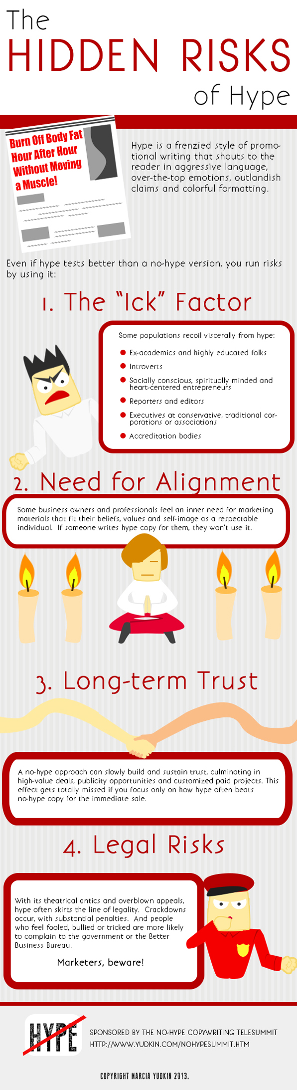
You can of course use infographics as part of a guest blog post. That’s what I did both here and at Marketing Profs, which just featured another infographic I commissioned:
http://www.marketingprofs.com/chirp/2013/11626/the-epic-face-off-in-copywriting-hype-vs-no-hype-infographic
Thank you so much for this information. A wish granted for me! (And I should know, I’m “The Wishing Faery”). But when I’m not The Wishing Faery, I do freelance creative marketing. (cause I need to eat too)
On Monday I’m pitching a new client whose information needs to be simplified (big time!). I’m an Old School Creative Director, who dove off the corporate ladder (head first, with a twist) in 2007. Thus, I’m not that updated on all the buzz words like “Infographics”.
While researching current trends I came across this article and it turns out… its EXACTLY what I was going to pitch to my prospective client.
Thank you SO much for giving me concrete, researched professional advice to present to him. It really was a WiSH come true.
I’ve signed up for next week’s teles-eminar and looking forward to hearing much more from your magical brains.
Best WiSHes,
Penelope Pendragon
The WiSHing Faery
~Always WiSH Responsibly~
So glad Marcia was able to help, Penelope. I love the way she explained everything so clearly both in the infographic and her guest post. Good luck with the project for your client, and thanks for letting us know how much the post helped you.